AI Cloud
Magellan BI & Reporting Dashboard Editor
Create a dashboard
Getting Started
Reserve a User Account
- This lab is built on a shared Magellan demo image. You will be allocated a username on the system that you'll use for the lab exercises.
- Click the button below to Start the App.
Note that if all the lab logins are currently in-use, you will need to wait until an account becomes available before you can continue with the lab module. - When you click, a popup dialog will appear with a Username, Password, and a link to launch the application.
-
Click the link in the dialog to Open the App and then login to Content Server
- Username: user2xx
- Password: User2xx@
- replace xx with your assigned workstation number, e.g. user205
- After remembering or writing down the username and password, you can close the username dialog window then scroll down to continue with this lesson.
The user experience of Magellan BI & Reporting was re-imagined to make dashboard creation simple, intuitive and delightful.
We refer to the new UI as the ‘modern’ user interface that gives the dashboard user access to everything close at hand.
We also set out to accelerate user adoption and to minimize the learning curve for new users by adding new features such as automatic chart suggestion. This helps ensure that the best information design visualizations are displayed by default.
BI & Reporting
Accessing the Magellan BI & Reporting Information Console
- Log into the Information Console
- Username User2xx (you will be assigned a user number)
- Password User2xx@
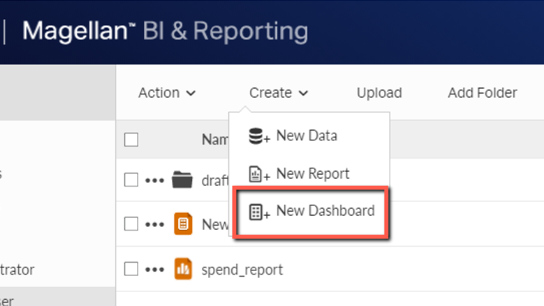
In Info Console, select Create | New Dashboard from the top menu
Add available data by clicking on the associated button in the Data tab on the left side of the editor
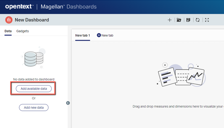
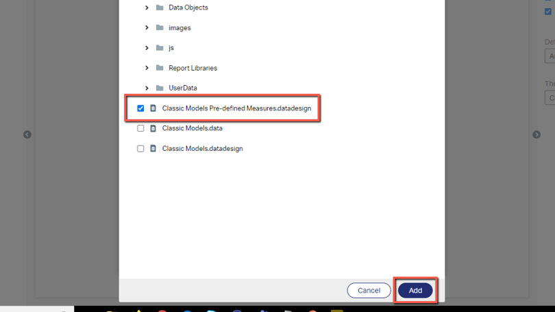
- Select the Classic Models Pre-defined Measures.datadesign
- Click the Add button at the bottom right
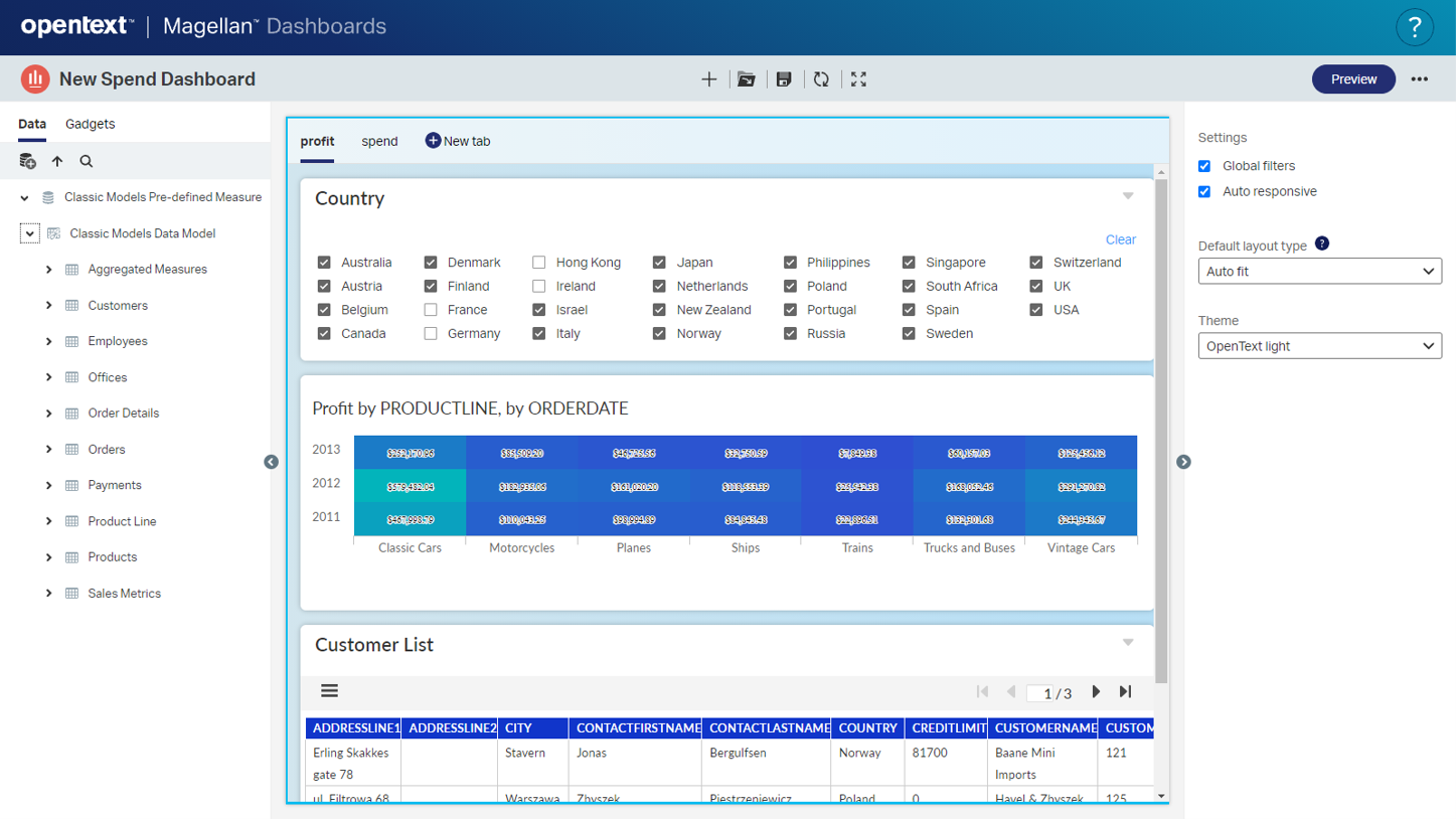
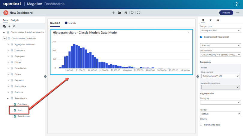
Drag the Profit field from the Sales Metrics table to the dashboard canvas to automatically create a histogram. Note the automatic chart type assignment based on the data type.
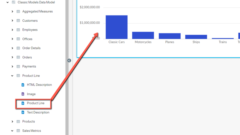
Drag the ProductLine field from the Product Line table onto the Profit chart to make it a column chart. Note the automatic chart type assignment.
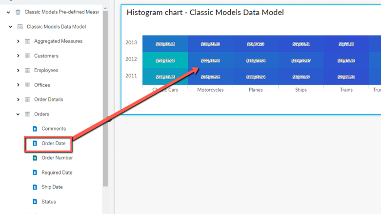
Drag the Order Date field from the Orders table onto the chart to make it a heatmap chart.
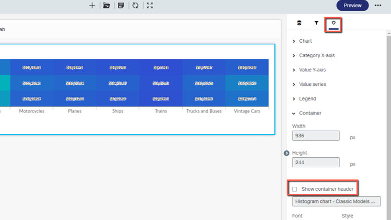
Hide chart gadget’s container title by selecting the gear icon in the properties section on the right side of the dashboard editor and uncheck the “Show container header” checkbox.
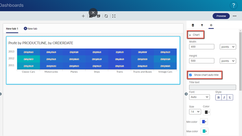
Automatically generate the chart title by expanding the Chart property above and check the “Show chart auto title” checkbox. Note the generated chart title near the top of the chart gadget.
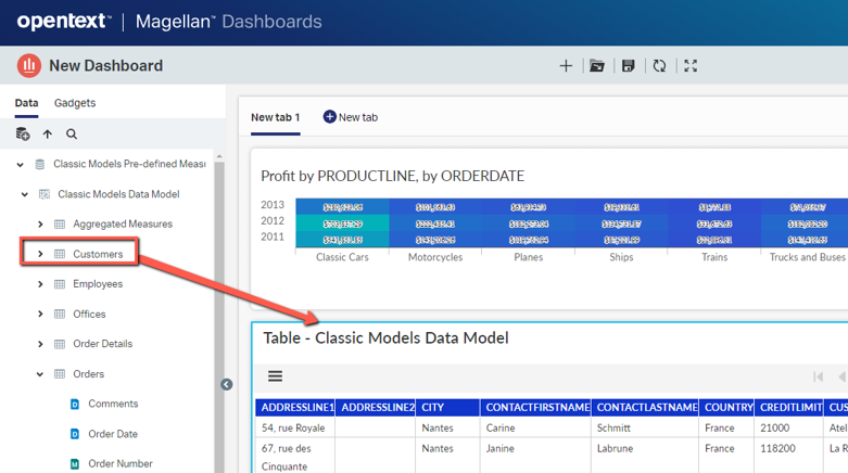
Drag the Customers table onto the dashboard canvas below the chart to display a table gadget populated with the Customers table data.
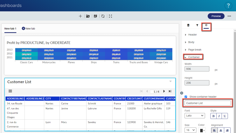
Change the container title to Customer List in the property settings. Expand the Container property and type in “Customer List” in the field below the Show container header checkbox.
You now know how to create a dashboard, add content from data, and customize property settings. In the next section we’ll learn how to filter data in the dashboard gadgets through data selectors.
Click here to view our library of common issues and troubleshooting tips.
Reach out to our support team with your questions, click the button below.